It’s been a hot minute since I’ve shared anything about my house. So, I thought it was about time to share some interior design ideas for small homes. I live in about 1500 square feet, but it feels much bigger.
If you are one of the 5 people who regularly reads my blog (hi mom!), you might remember when I first shared that I bought a home or the 6 month update after I had painted EVERYTHING.
For about 7 seconds, I thought I was going to turn into Young House Love and be a full time home blogger, but in reality it costs a lot of money to always have a home project going on. So, instead I’ve made tiny tweaks over the last years and while I’m not an interior designer, I can honestly say sometimes when I see my house, I’m like, wow, I made that. I feel like we’ve really “lived” in this space and I have some great tips for small home owners.
My Top Interior Design Ideas for Small Homes
- Utilize inspo pics. Unless you are just a magician, you randomly buying stuff at Home Goods, is not the way to pull together your small home into a masterpiece. Have inspiration pics that you keep coming back to, that help you utilize your space sufficiently is so needed. Stay focused on your vision.
- Use one paint color throughout the house. I’m not saying you can’t paint a kids’ bedroom or bathroom with a pop of color. But when each room is painted a different color, it makes the house feel smaller, because each room is more accentuated, instead of having a steady flow, that allows spaces and their size to blend together.
- Hide your storage when you can. Think ottomans that open up, poufs that have zippers and can actually hold stuff animals, blankets or toys. Utilize the backs of closet doors, and ORGANIZE, to get the most out of your storage spaces
- Have LESS!!! Or if you’re really into holidays, etc, have a strong storage plan, for swapping things in and out. Your strategy should be if I buy something new, something probably needs to go. This may not be true for art, or things that go on the wall, but if it takes up space, eventually things will feel cluttered. I go to Good Will at least once every 2 months with TONS of things, because I honestly don’t have space.
Want to see how I utilize my small home’s spaces?
My Studio/Office Space – Also my formal living room if guests come over.
You can shop most of these spaces at this link here or most of the individual blog posts of each room.
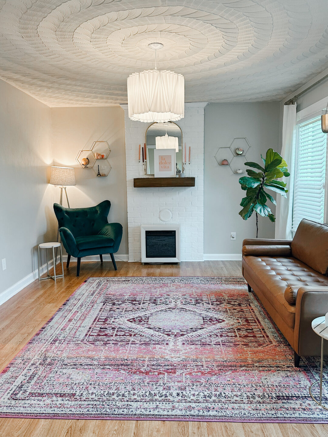
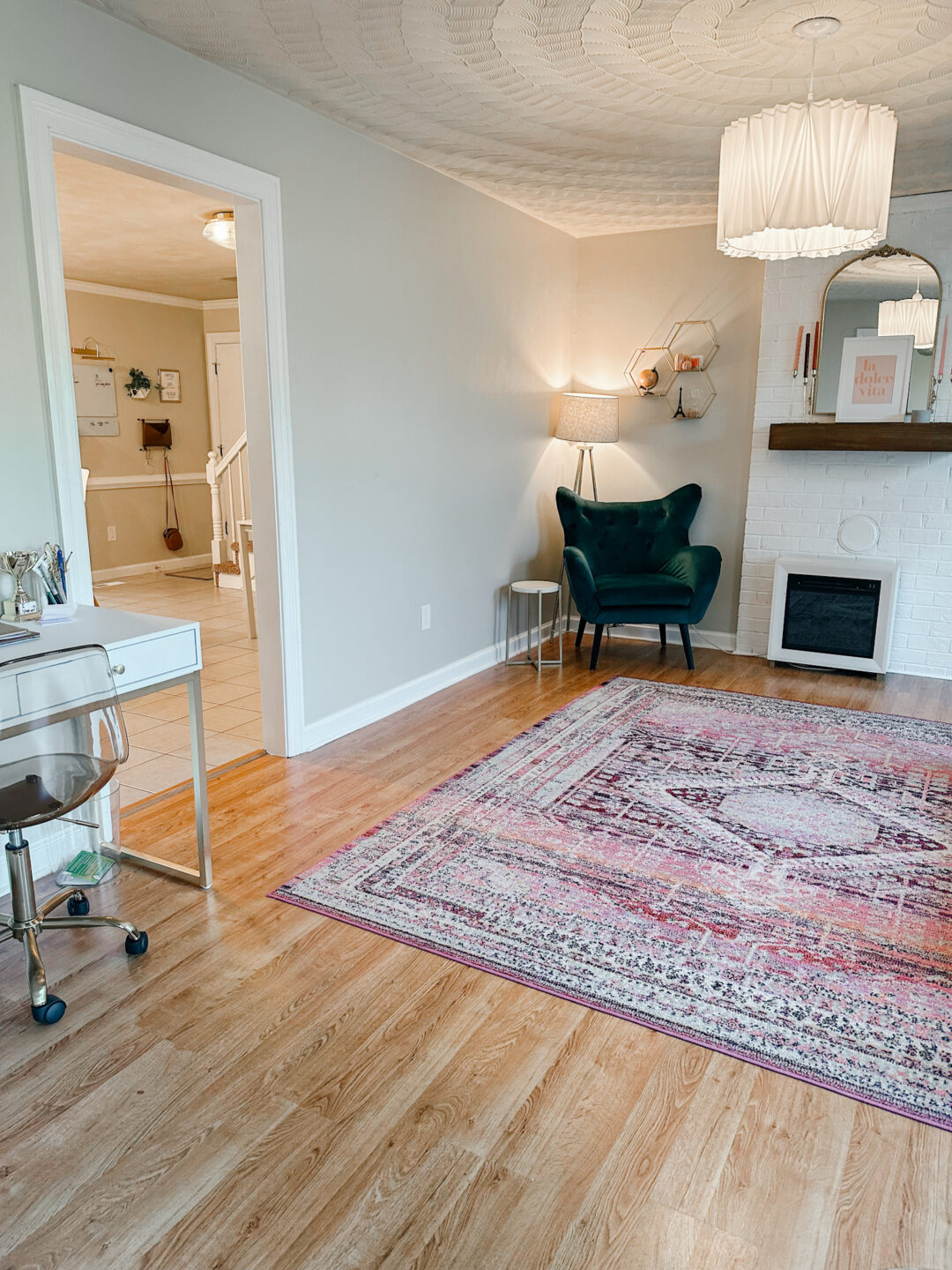
I don’t love the cut through from this space, into my kitchen/dining area, but you can see having one paint color helps to make the transition more seamless. I actually shared some more close ups of this space, on my 6 month re-cap and this room hasn’t changed much.
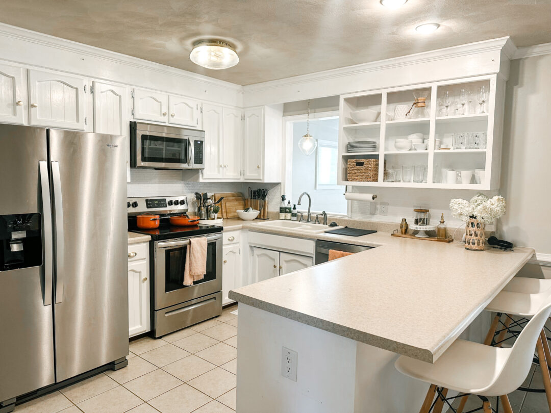
My Kitchen Reveal
I just realized I’ve NEVER shared my kitchen on my blog. Last spring, I did a labor of love, and painted my high glossed, brown cabinets white. I also replaced all the appliances to stainless steel. It was definitely not a full renovation, but it made such 👏 a 👏 difference!
I would not recommend this to everyone, depending on cabinet shape, location etc. But I took a few of the cabinet doors off of my cabinets to “open up the space” and it turned out rally great in my opinion. The look is not nearly as nice as open shelves, but little touches can go a long way in making small spaces feel more open.
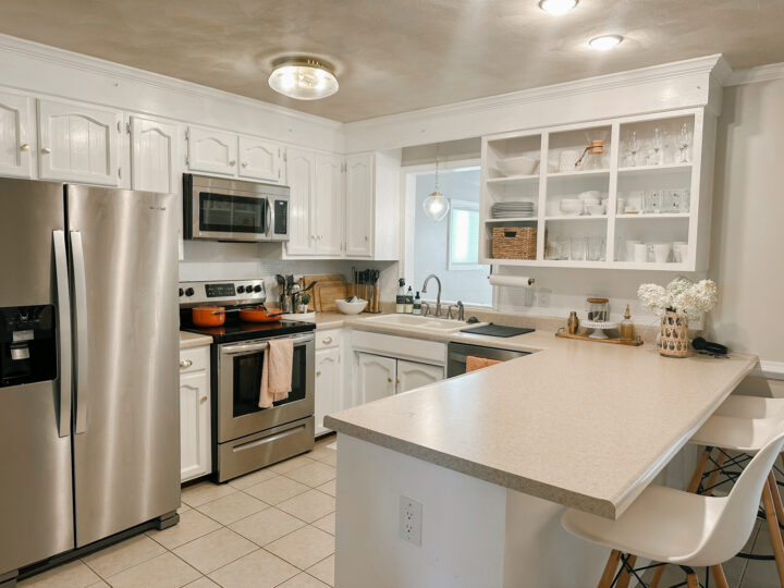
I actually had a really small space for my fridge. There were so few stainless steel refrigerators even available in that size category. And this one barely fit, but we squeaked it in, and the fridge was the final touch. Seriously, go back and check out my first home blog post, to see the difference in the kitchen. It’s amazing.
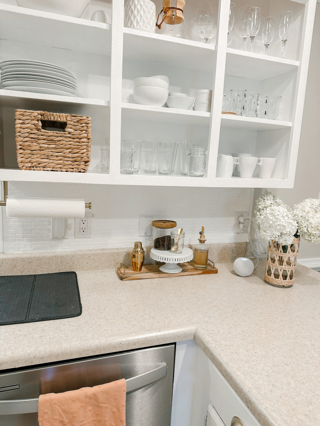
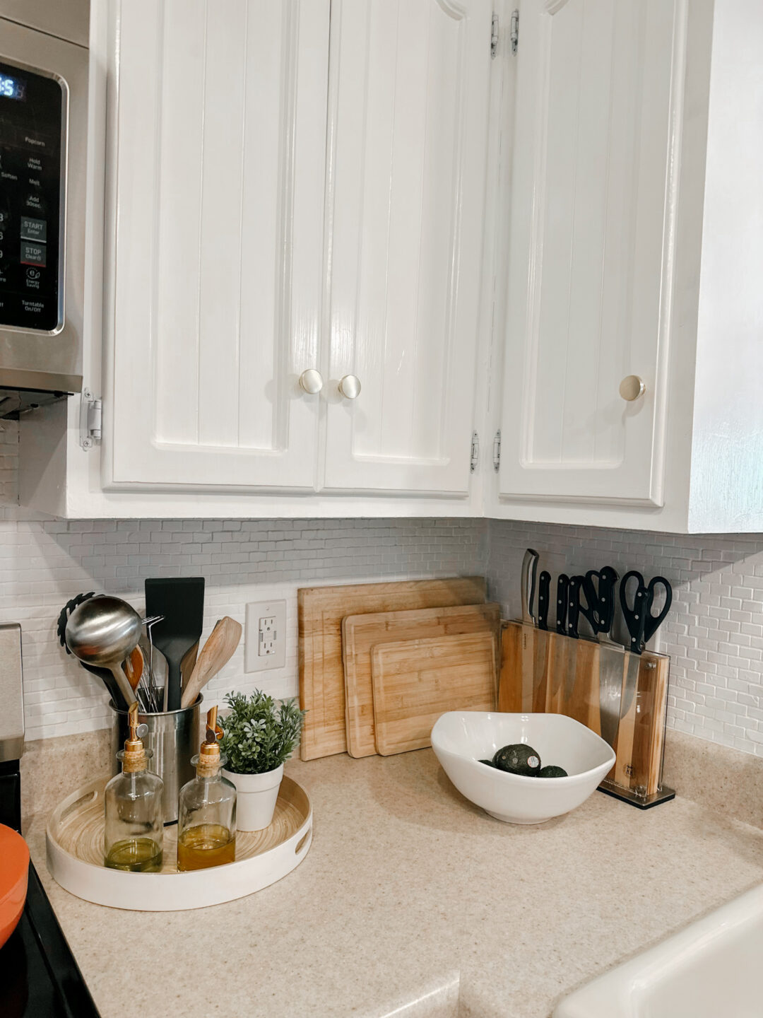
Most of my kitchen details, you can find linked in my Amazon Storefront.
Living Room
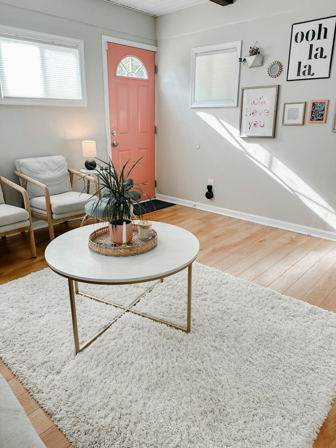
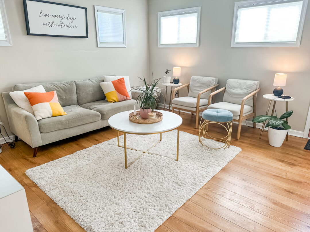
I am so grateful for this space. This was a sunroom at one point, that the previous owners finished and I’m so glad they did, because it adds a MUCH needed touch of coziness. I’m really looking to get an L couch at some point, but we make do with what we have some times.
To help with spacing, I have smaller furniture which does help open up a room, but might not work, if you live with someone really tall. As always, decluttering and leaving the walkways clear help open up a room too.
All the Bedrooms
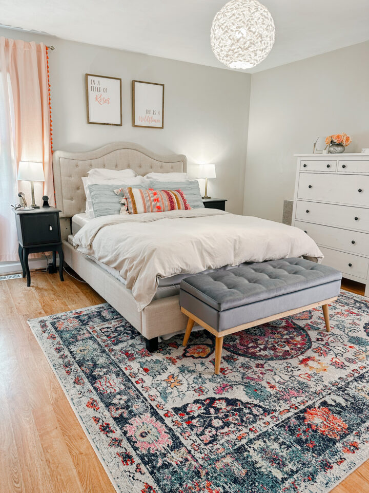
Starting up with the primary bedroom. I have detailed this room before, but honestly it looks fairly different now. As I changed the bedding, rug and added a little seat at the end of the bed. You can see all the details at the blog I linked.
Boys Bedroom
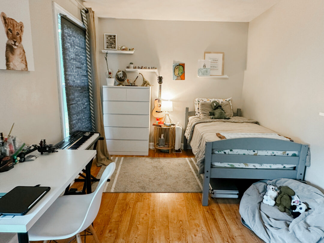
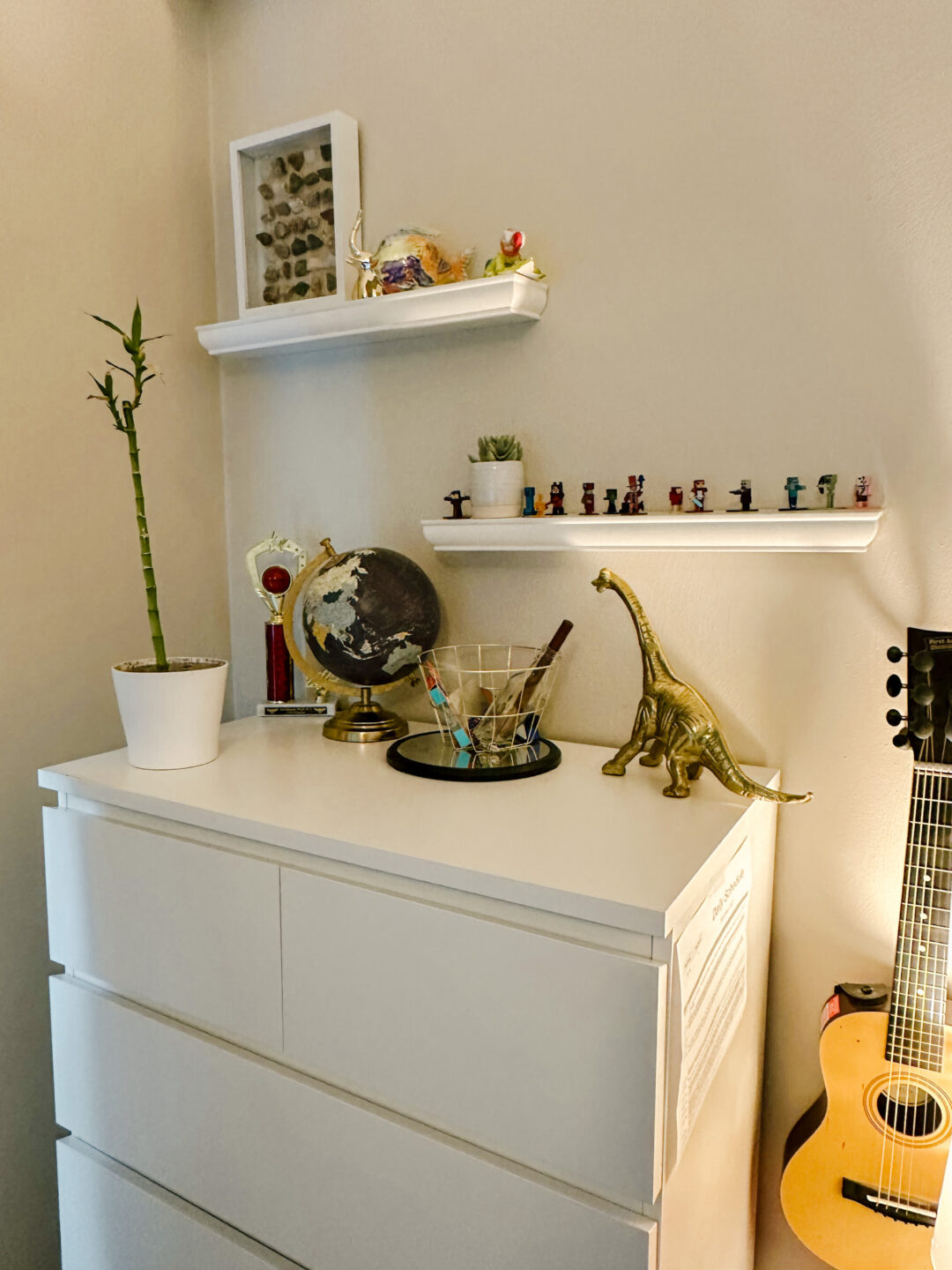
This is the room of my youngest child, whom I adore, but is also a bit of packrat. I toe the line between trying to allow him to express creativity and throwing all his junk away. Both of my boys shared a room when we first moved in, and I honestly ADORED their room. We very intentionally used their space when there was two beds in the room, but now, there’s more room, and a lot more “stuff” has moved in with it.
But one interior design tip to make spaces feel bigger is to leave open or blank space. So, here where the rug is, without furniture, stops the room from feeling cluttered.
My Tween Boys’ Bedroom
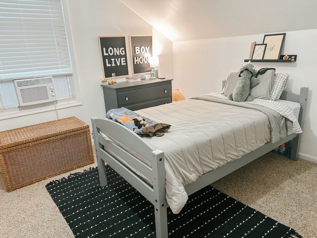
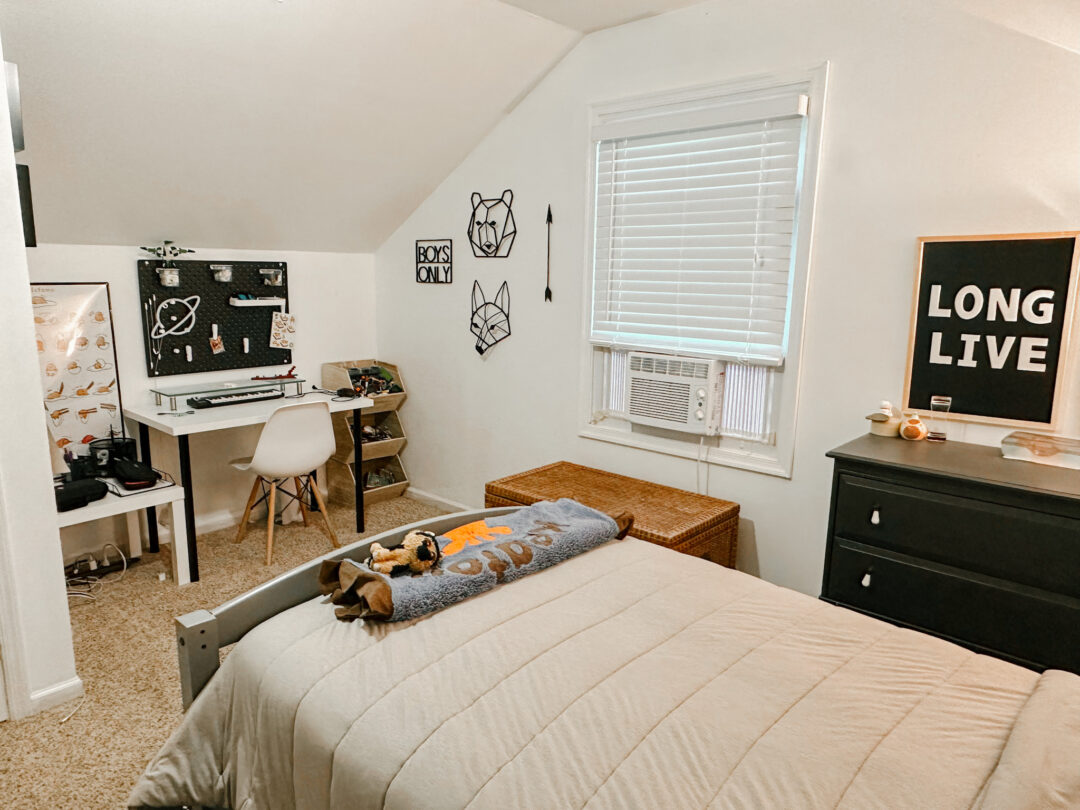
You can check out all the details for this tween boys space here. This room has a slightly slanted ceiling, and to my dismay, we had to poorly utilize the room space with the bed sticking out in the middle. But the shallow ceiling, made this the most functional use of the room, so while not super space efficient, it’s still really cute. The wicker chest helps hide necessary items, and leaving space to walk around the bed, helps make the room not feel too heavy.
So, there you have it. Do you feel like you got some good design ideas for your small space? I hope so. Thanks for following along. Comment with your favorite room below.

Loved it! Each space is so functional! Mom comments for the win!💛